
200th anniversary of the Dutch government
Keywords:
Interactive exhibition
UI/UX design
App design
On behalf of:
Noodlewerk Apps
Staten Generaal
For the 200th anniversary of the Dutch government, I joined up, as part of Noodlewerk Apps with LetterZDesign (execution), Studio Duel (graphic design), Two Kings (website & mobile apps) and Uberdutch (concept & design) to create an exhibition for visitors to learn about the rich history of the Dutch Parliament.
My role in this collaboration was to design and build the interaction with three 'interactive pillars', equipped with touchscreen interfaces (iPads) and an external screen. One pillar allowed visitors to browse through the current MPs and the other two pillars allowed visitors to see interesting videos.
One project, two different products
The exhibition had a total of three 'interactive pillars'. Each interactive pillar was equipped with an iPad and an external screen. But even though there were three interactive pillars, there were only two different types of interactive pillars:
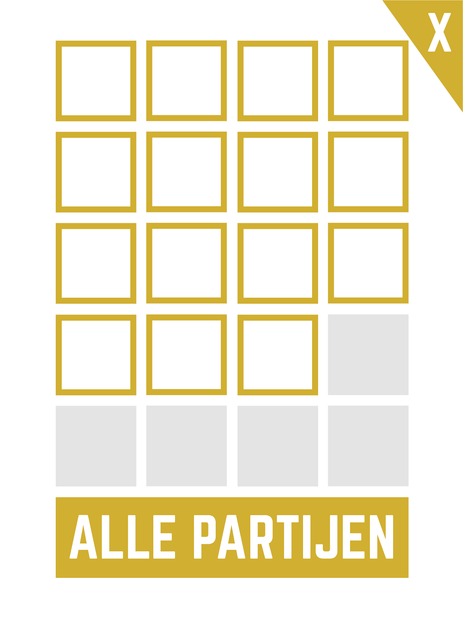
- One pillar, the 'members pillar', allowed visitors to browse through the current MPs and to read some details about each specific member on an external screen
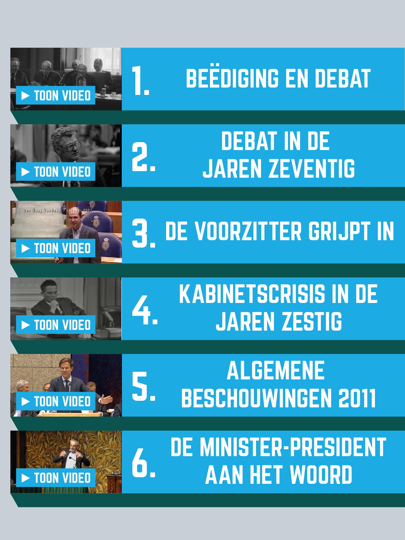
- The other two pillars, the 'video pillars' allowed visitors to choose a video from a list to see it on an external screen.
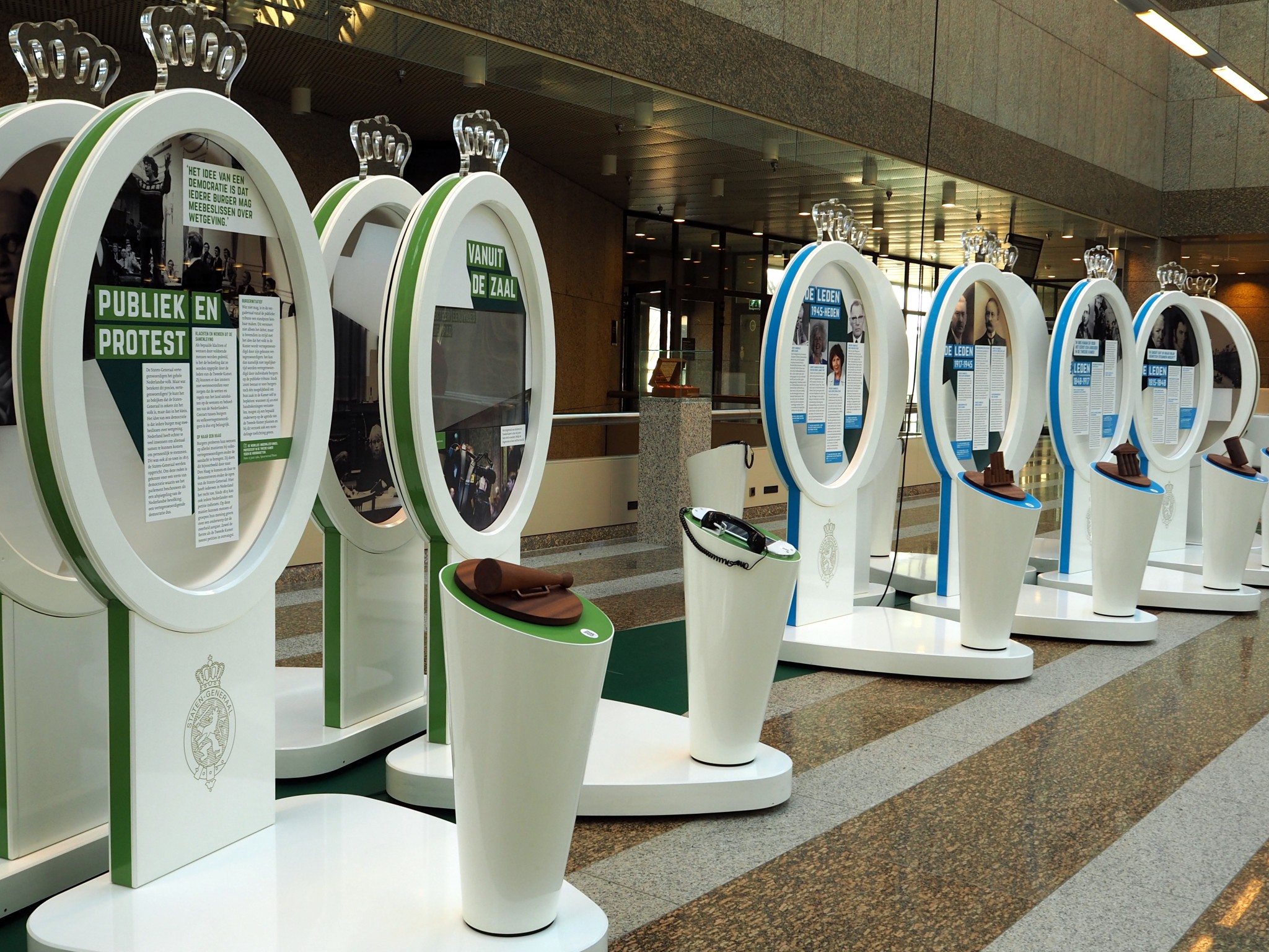 Part of the exhibition. The second pillar is one of the interactive pillars that allowed users to select a video and see it on an external screen.
Wireframing the interface of the 'Members pillar'
The primary goal of the touch screen interface for the Members pillar is for visitors to be able to browse through the list of current MPs and to be able to select one MP to see some information about this person.
Therefore I decided that the main view should have a grid of portraits. And, to encourage visitors to select and display MPs on the external screen, I deliberately choose to not show their names or which party they belong to in the main view.
However, to also make browsing more engaging, I decided to allow visitors to search by name or filter by party. For both applying a filter and searching a specific member a different view is overlayed on top of the main view.
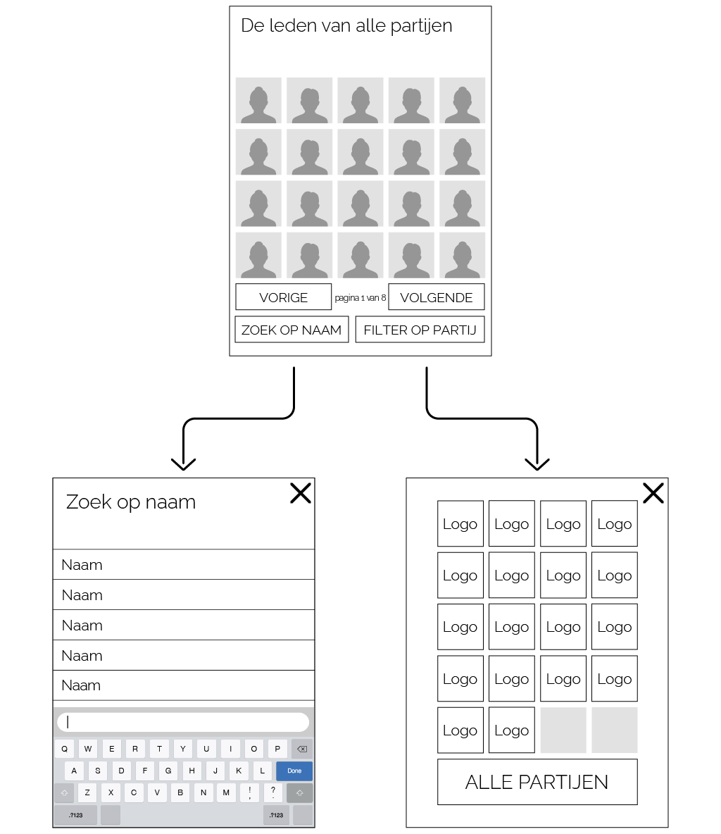 wireframe of the 'Members pillar'
Wireframing the interface of the 'Video pillars'
The touch screen interface of the Video pillars was quite a bit simpler. The main view only had to contain several buttons to allow the visitor to choose which video to play.
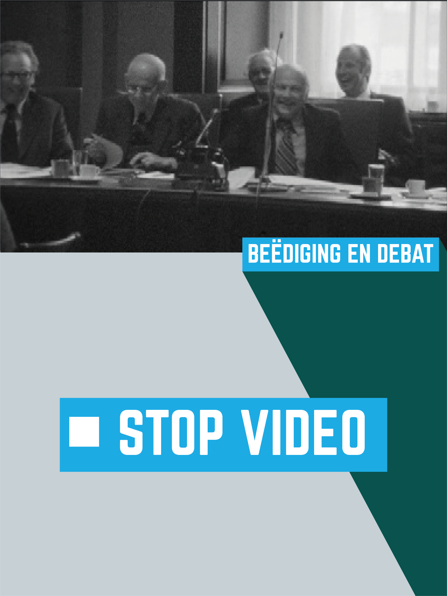
However, I decided to add a second view to the interface; a view that shows which video is playing and allowed the user to stop the current video by using the big 'stop' button.
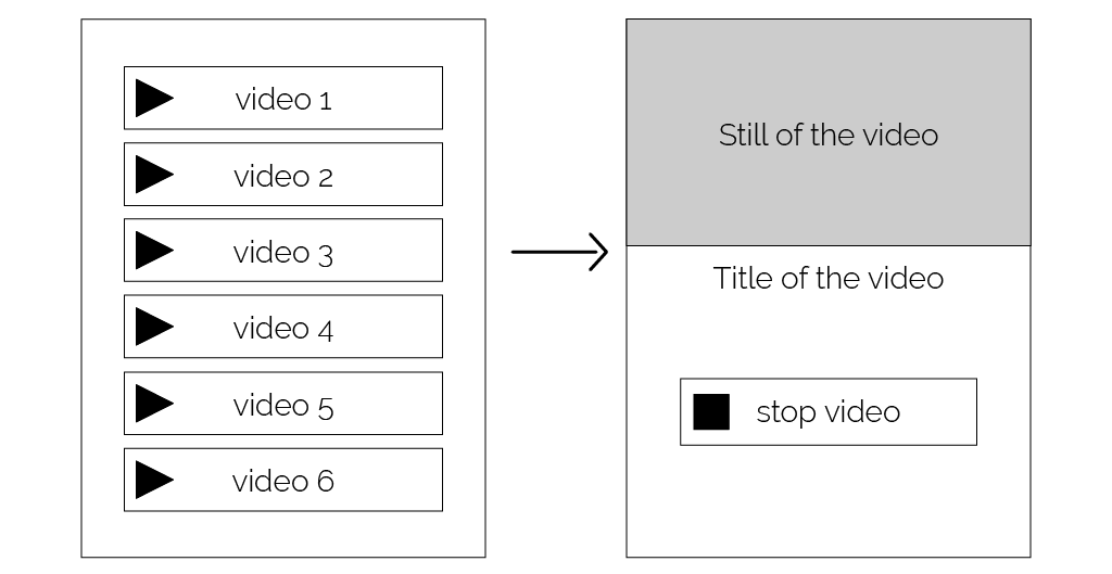 wireframe of the 'Video pillars'
UI-design
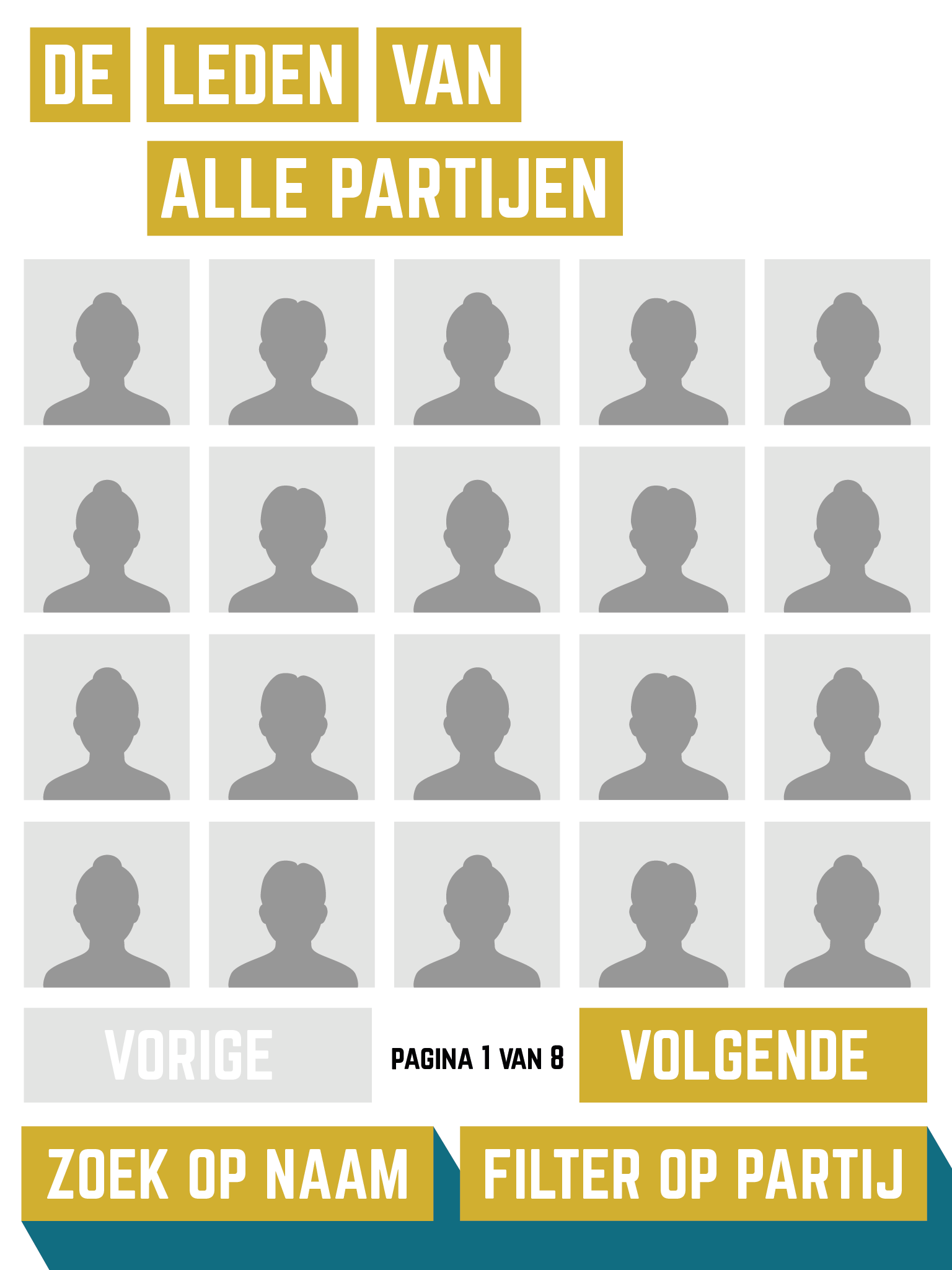
Studio Duel designed all the graphical display of the none-interactive pillars of the exhibition. To make the interactive pillars fit their design, I analysed their work and applied the same graphical elements and typography to the UI of the interfaces.
Conclusion
I really enjoyed working on this project. It also felt like an honour to have worked on something, as a starting designer, that's on display for 6 months to celebrate the political history of my country. And I can honestly say that I have learned a lot from this project:
First of all, it was the first project for me in which I worked together with people with their own specialties from other companies. I really liked the dynamics of everyone contributing in their own way to accomplish one common goal.
And secondly, designing for an exhibition is quite different than designing an app or a website. The time somebody spends figuring out how your design works during an exhibition is probably even shorter. It's imperative that everything must be clear within a glance, while at the same time your design must be interesting enough for people to want to interact with it.