Snapture!
Keywords:
Industrial Design
Exploring Interactions
Massive Open Online Courses
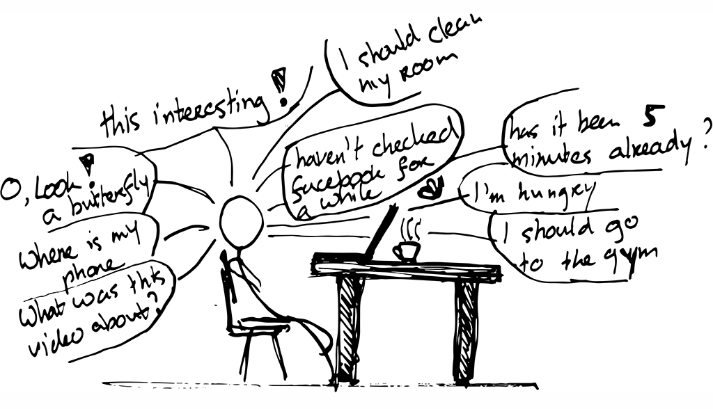
Due to the passive nature of learning by watching videos from Massive Open Online Courses (MOOCs), students tend to get the urge to fidget with something and easily lose concentration.
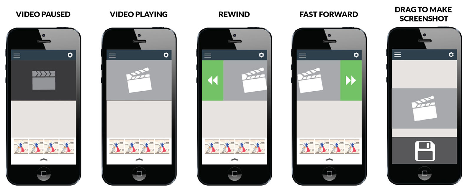
The Snapture!-app allows students to ‘fiddle’ with their phone in a productive way and gives them more control over the flow of information from educational videos.
Snapture! is linked to the video and allows the student to precisely capture only the information that they see as useful, in the form of screenshots or short videoclips which are saved to their phone. The captured information can be easily processed later on.
Aim of the assignment
Snapture! is the result of the course Exploring Interactions, as part of the Design for Interaction master at the faculty of Industrial Design Engineering. The aim of this course is to investigate interactions by means of various explorative design research activities conducted with fellow designers as well as non-designers. To this end, different tools were used such as sensitising booklets, interviews and prototypes.
Context of the project: Online Learning
Nowadays, prestigious universities from all over the world create MOOCs that are freely accessible for everyone to follow at home in their spare time. These MOOCs make use of the capabilities of the internet to deliver content on all sorts of topics to the online students. In most MOOCs, videos are central to the student learning experience.Even though these videos might make the study-material more vivid, at the same time they present some downsides. Videos have a linear narrative in which the order of the material and the pacing is predetermined. There are no means, for the student, to actively engage with the material.
Process
Finding the design goal
This project started out with a simple observation:
When watching educational videos, people tend to get bored and, because of that, get distracted.
The quality of the video and its content exert only little influence on how engaging the video is. The video itself is not boring; the activity ‘watching videos’ is boring. The student has to sit still when he wants to actively grasp the knowledge. In order to find a solution to this problem I transformed this observation into a design goal:
I want students to have an active online learning experience by giving them a hands-on experience with the content.
The next step was to determine when exactly the student should be active and of course how and with what intensity (bodily or cognitive).
Context mapping
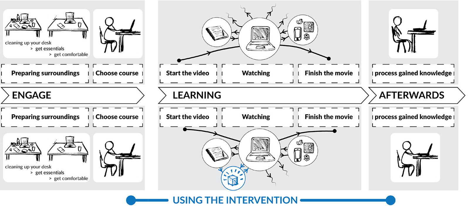
While trying to determine at which point in the process of self-studying the design intervention should take place, an important finding is that students tend to be very attached to their own personal rituals or routine during self-study. An effective intervention should not break this routine, but actually complement these personal rituals. Because of this exploration I decided that my design should be used while watching educational video in order to support the students.
Testing design interventions
During the initial research phase, I determined two interesting directions I could take this project:
- A little distraction
- Be active with the information
I explored these directions by conducting user tests in which participants were given different types of small design interventions to interact with. This led me to conclude that putting fresh information to use is an activity that most prefer to take place after watching a video and not during. What the interventions showed me was that it was not desirable to ask the user to divert their attention. The users do not want to be distracted, they want a tool that helps them focus.
Towards the solution
One thing that still stuck out to me from the context research as well as the user test is that people find fiddling with something physical while watching a video pleasurable. Often times, this object is their smartphone. What if instead of fiddling with social media and other distractions on your phone, you could fiddle with the content of the video? This thought led me to my final design direction:
Enable the user to filter and summarise the information from a video by means of fiddling in order to process the knowledge after watching the video.
To validate this design direction I conducted user tests in which participants were shown a video with a comprehensible narrative and many graphical images. The participants were given the option to acquire the charts and the graphs which appeared in the video as printed images, but only at the time they were shown in the video. After watching the video the participant was asked to make a mind-map with the information they gathered.
With this test I discovered that the participants were both actively involved with the content of the video and at the same time could retell the story in far more detail. This proves that reorganising information, without actually drawing or writing down all the information is already very effective in remembering the information.
The final prototype
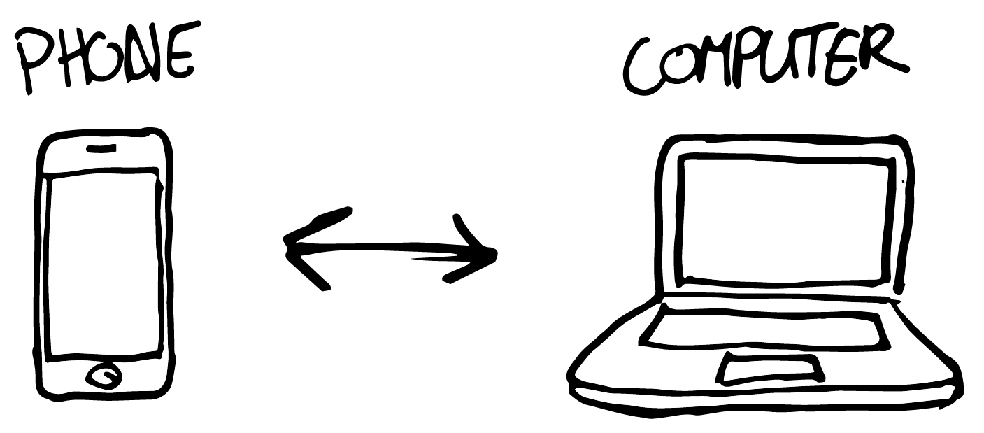
This project was not finished for me if I did not create a prototype which demonstrated my desired interaction. To achieve that it was very important that the user was able to grab a bit of a video from a computer and save it on a smartphone.
The hardest part was to find a way to get the technical bits together. At the time I did not know a thing about creating native smartphone-apps, however, I did already have some Javascript-skills (from creating websites). And, after some research, I discovered that it was also possible to create javascript-websites that communicate with each other instantaneously, by making use of Node.js. Also, I discovered that with Javascript it was quite easy to take a screenshot from a playing video.
My final prototype was able to grab screenshots of the video playing on my laptop. Next to that, it gave the user basic control over the video (play/pause, rewind and fast forward) in an intuitive way by making use of the possibilities of a touchscreen.
