Feed Me
Keywords:
UX design
Visual design
Animations
App development
Copywriting
iOS
On behalf of:
Noodlewerk Apps
Feed Me is a mobile application for parents of newborn children. It can be used to easily track and set goals for the nutrition, sleep, diapers, and medicine use of your child so you can make sense of their daily care.
This project is based on a prototype made by a colleague and started for me as a test case. This project allowed me to exercise all sorts of skills, varying from competitor research, UX design and Visual Design to application architecture and cloud syncing. Eventually, the project grew out to be a complete and shippable product.
Curious how it works? You can download the app for free from the App Store.
Feed Me and the market
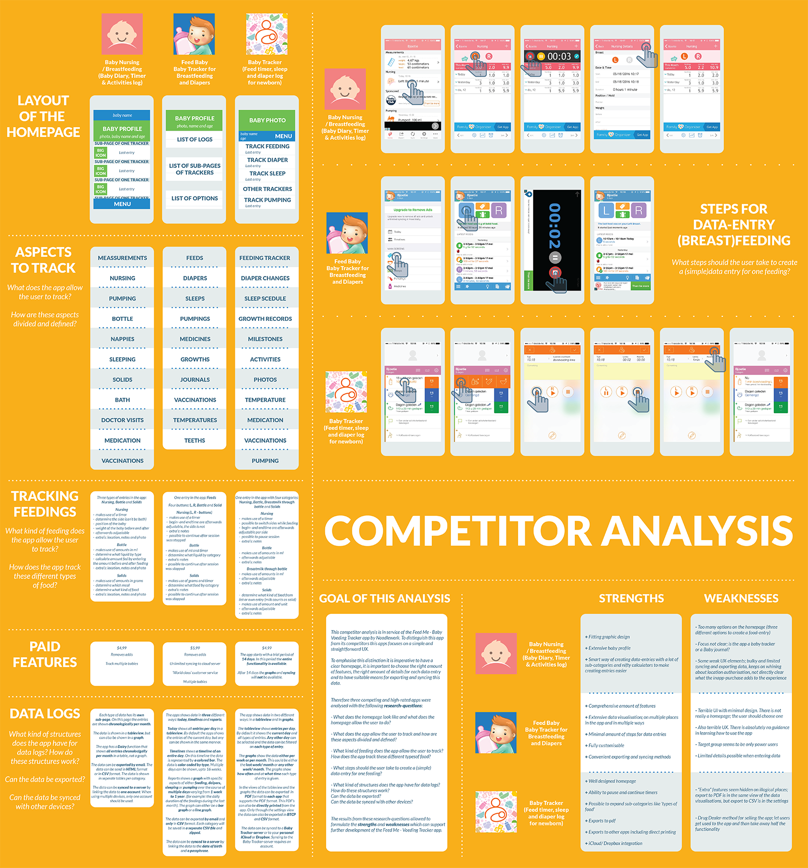
To better understand the current market of child-care apps and what Feed Me should bring to the table as an alternative, I conducted a competitor analysis to investigate what existing apps do and where they fall short.
The findings from this analysis of competitive applications have been summarised in an infographic.
For Feed Me, it was important to get the right balance between simplicity and extensiveness to provide an experience where parents feel in control of the care of their child, while also making it as smooth and easy as possible.
One screen application
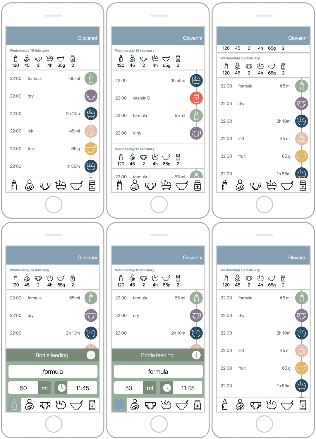
To achieve simplicity in everyday use, all the main features are located on one screen. To facilitate this, the main screen of the application has a clear hierarchy:
- The navigation bar in the top of the screen shows which child is now selected.
- The middle section shows the entries chronologically as well as day totals.
- The tab bar in the bottom of the screen is the starting point for creating new entries.
For each of these three levels a careful balance between conventional and unconventional UI elements has been established. New interactions are based on known conventions, in order to establish a gentle learning curve and predictable behaviour of the application.

Simplicity in interaction
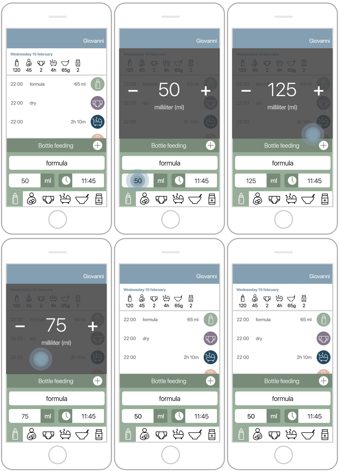
To be able to quickly and simply add entries I created a custom one-handed interaction. Having a child results in not having a lot of free time and, most of the time, you probably only have one hand available.
Values can be adjusted with a quick panning motion. Pan right to increase the value and pan left to decrease it.

Visual design and textual communication
Choices for the visual design were made alongside the creation of the UX design. The way the colours are used communicates and strengthens the UX design. Because there's already a lot going on on the main screen, I opted for a non-distracting neutral style to create calmness and clarity.
Safe and user friendly cloud storage
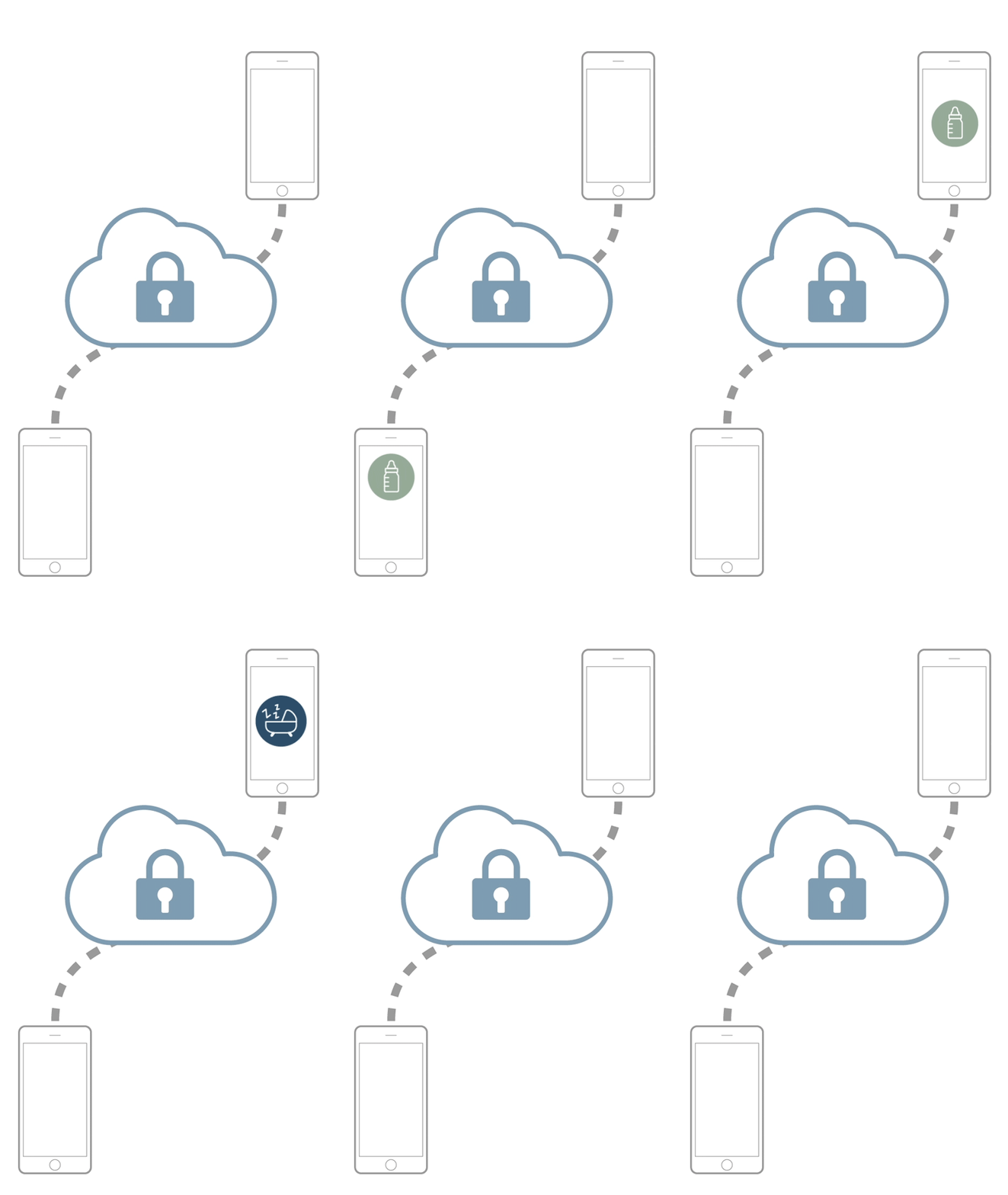
To allow parents to backup and share their data in a safe and user friendly way I made use of Cloudkit. This is a technology from Apple that provides cloud storage without the need for a separate account and password, because it makes use of the Apple ID of the owner of the device the application is installed on.
Custom application architecture
The application divides certain features, such as creating a new child profile, into multiple steps to make those processes as frictionless as possible. I wanted the code to resemble the way people interact with it. In order to write code for this in a sustainable way, I developed my own architecture. If you're interested, I have distilled this logic into a separate Xcode-project and uploaded it to Github.

